Empowering gamers with bold visuals and cutting-edge design for MSI's Gear Up Game On campaign.
European Le Mans Series:// Rebranding
/Branding & Digital
_Year
2018
_Industry
Motorsport
_Skills
Branding
Lead Art Direction
Print & Digital
Social Media
Motion Design
What is it about?
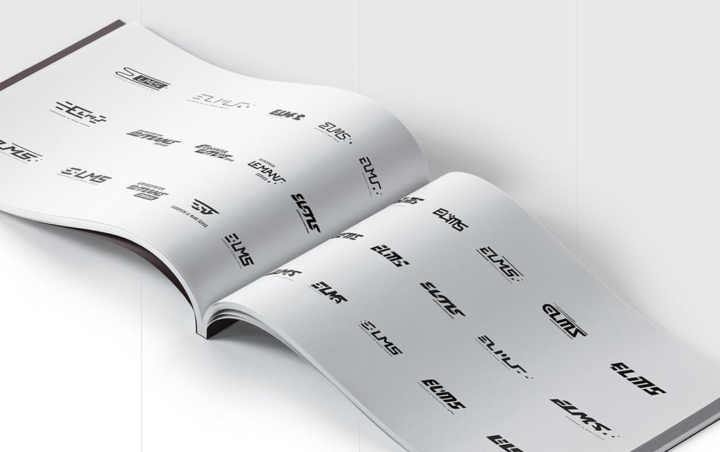
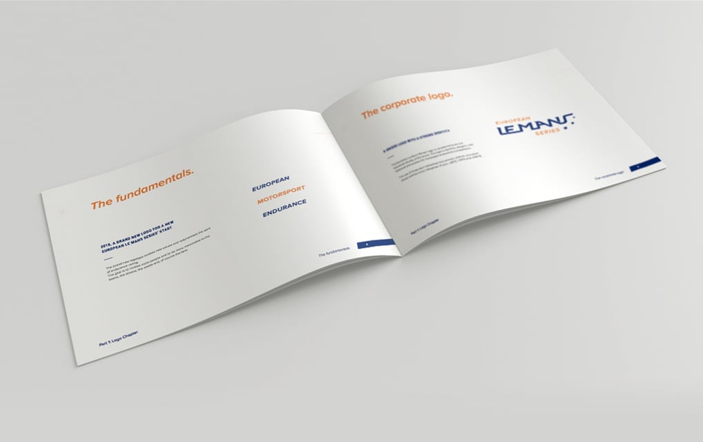
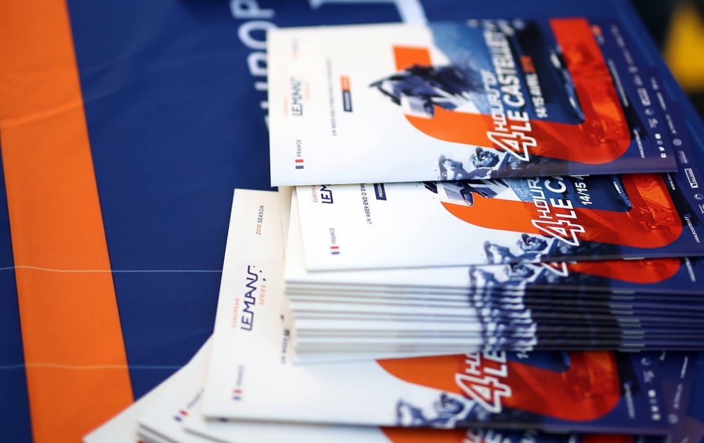
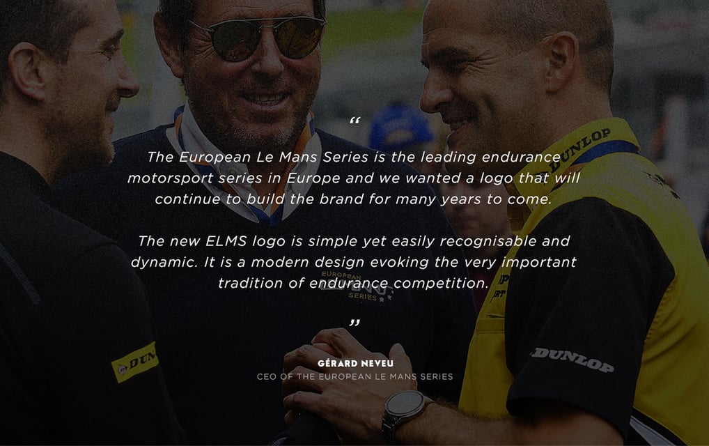
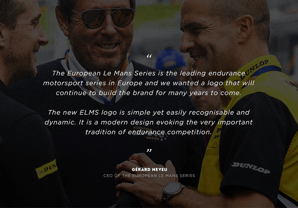
After a successful pitch, my logo design was chosen to lead the rebranding of the European Le Mans Series. The challenge? Capture the excitement of endurance racing while keeping a strong European feel.
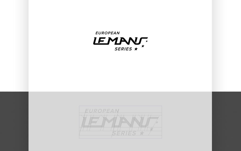
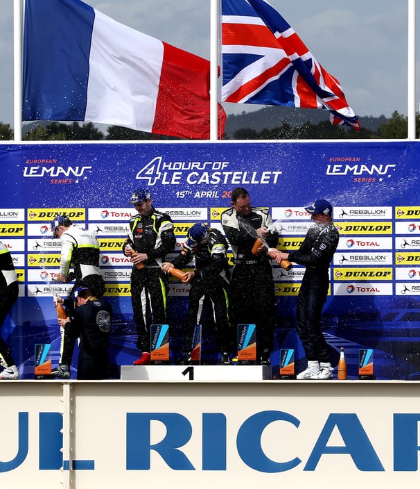
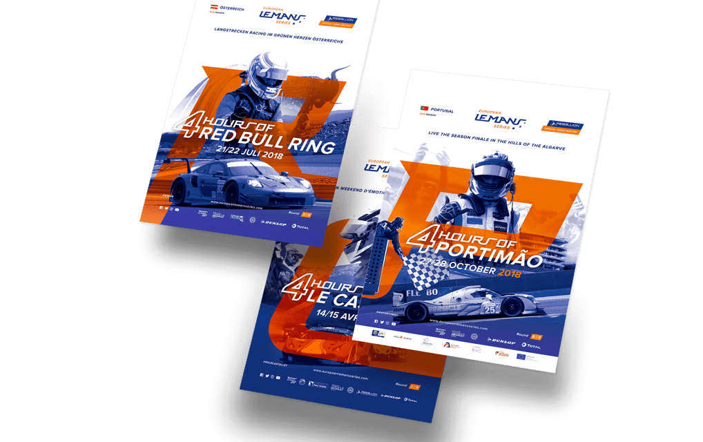
The new logo is inspired by the curves of a racing circuit, adding a sense of speed and movement. Three stars rise above the track, a nod to the European flag and the top three podium spots. This visual adds a touch of competitiveness and prestige to the brand.
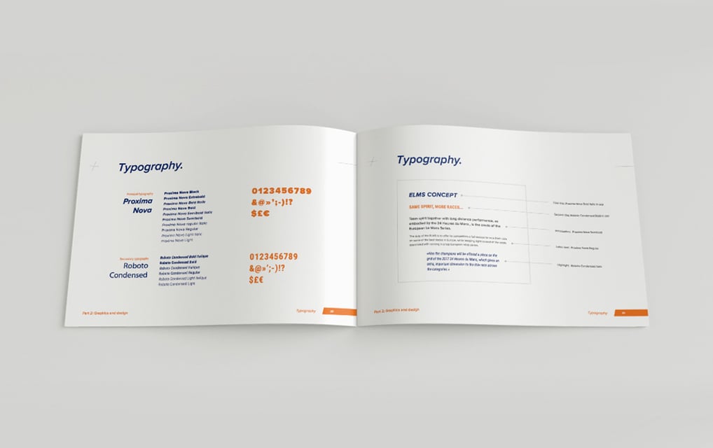
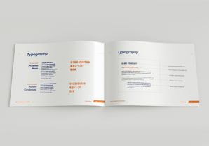
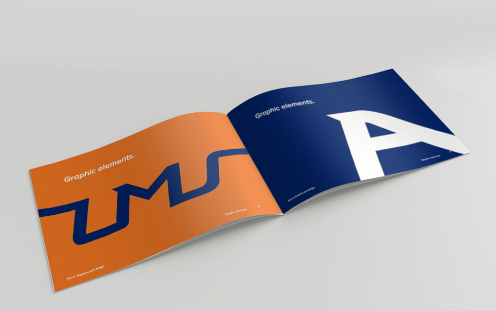
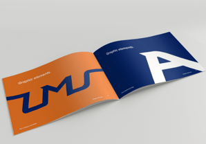
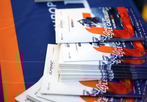
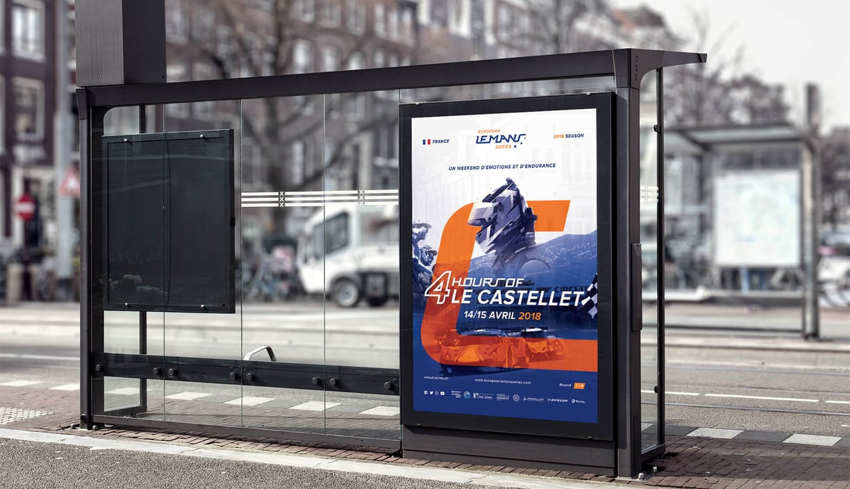
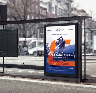
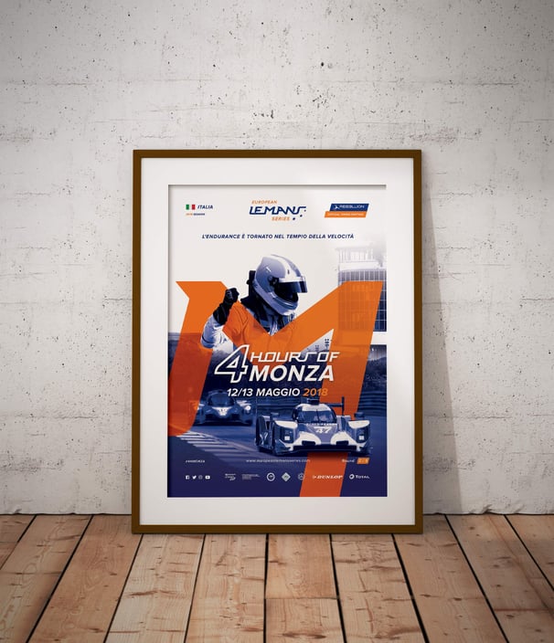
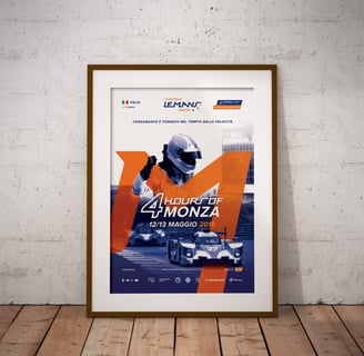
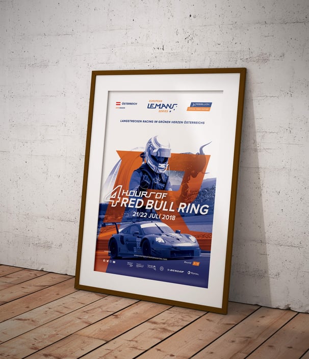
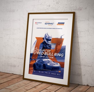
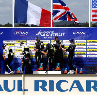
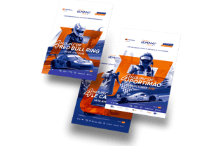
Beyond the logo, I developed the entire visual identity, from the brand book to the 2018 season’s visuals. This included posters, podium graphics, badges, and social media assets. Each piece follows a bold, dynamic style that reflects the intensity of racing.
Simple, modern, and unified, the new look positions ELMS as a prestigious competition in European motorsport.